
 |
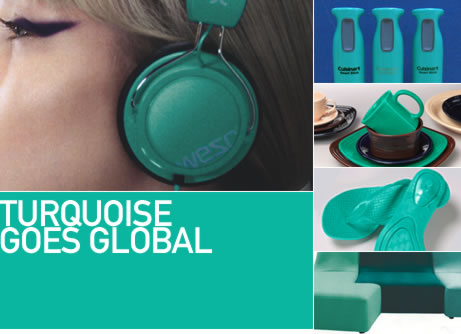
Turquoise has extended its soothing yet invigorating reach into quite unexpected places this year – from footwear to housewares. Have you spotted turquoise lately? We’d like to invite you, our readers, to send in your photos of turquoise wherever you see it. We’ll publish the most interesting submissions. Send entries to Tones@pantone.com with the word Turquoise in the subject line.
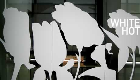
White in design has often been a tenet of minimalism or a driver of simplification and cost reduction. But today’s white represents quite the opposite: expansive magical thinking, openness, unlimited possibility. As we enter an era of optimism, the white page, the blank canvas, the clean slate – all of these connote a sense of new beginnings and reflect a new open mindset and a world of creative opportunity. Moreover, our new desire for white reflects our emerging need for purity and clarity, to grasp what is crucial and necessary, to conduct a moral inventory and rethink the essence of life. The new white gives us both the terrain of unlimited possibility and a compass for personal navigation. It’s no wonder that today’s architects, interior decorators and industrial, automotive and fashion designers all seem to be on the white path once again.
—Steven van der Kruit,
Global Prospective & Trends Director, Perfumery Division, Firmenich
| • | Turquoise Goes Global |
| • | White Hot |
| • | The Future of Luxury |
| • | Pumping Plastic |
| • | Indian Influence: 3,500 Years of Textile Design & Beauty |
| • | Home Furnishings 2011: Cottage Industry |
| • | Fall/Winter 2010: What’s On the Runway |
| • | Seasonless Dressing? |
| • | Package Design Trends: Searching for Value and Trading Up |
| • | Spotlight on Asia: Taiwan Turning PET bottles into Textiles |
| • | Spring/Summer 2011: Hues for Shoes |
| • | Weddings |
| • | African Rhythms |
| • | Fashion Color Report Fall 2010 |
| • | Milan Furniture Fair |
| • | This Issue's Contributors |
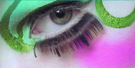
Turquoise
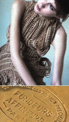 |
THE FUTURE OF LUXURY According to David Shah, publisher and owner of View Publications, product, distribution, marketing and price used to be the four pillars of the luxury market – and if you handled the first three factors well enough, everyone forgot about the fourth. While this formula worked brilliantly for a time as millions of consumers were totally seduced by status symbols and the need to demonstrate their affluence, now it is rather different. Of course the seriously rich are still spending, but there does appear to be a more lasting shift in western consumers’ preferences toward discretion and true value which is being reflected in their color choices. Warmer more saturated olives, intentionally faded whites containing elements of blue and pink, and cosmetic neutrals or blush- tones are emerging as the popular colors to connote understated wealth. view-publications.com |
 PUMPING PLASTIC Plastics have become an integral fabrication as consumers continue to look for products that utilize recycled materials. We are seeing plastics appealing to consumers at every level, from luxury down to the youth market. Check out Melissa, the 30-year-old Brazilian shoe company that, in its quest to marry art, design and recyclable materials, continues to develop relationships with such heavyweight design icons as Zaha Hadid, Karim Rashid and Vivienne Westwood. melissaplasticdreams.com |
||
 INDIAN INFLUENCE: 3,500 YEARS OF TEXTILE DESIGN & BEAUTY According to Keith Recker, editor of HAND/EYE Magazine, evidence of the beautiful and colorful textile arts of the Indus River civilization of Mohenjo-Daro dates back at least to the second millennium BC. As described by the Craft Revival Trust, India's continuum of textile innovation remains unbroken to this day. Spotlighted in HANDEYE’S recent online issue is Christina Gitti, who works in India to create her lovely collection of clothing and her home accessories line, Matta. Christina shares her vision, her views on working with color and the depth of her Indian influence at https://handeyemagazine.com/ content/indian-influence |
 |
|
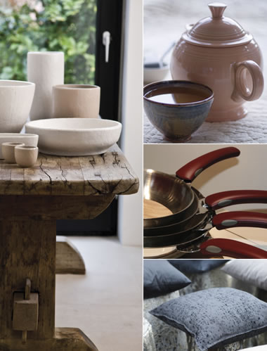
| HOME FURNISHING 2011: COTTAGE INDUSTRY Cottage Industry, a hot theme for 2011, illustrates how inventiveness is key when taking a tried-and-true scheme and marrying it to modern-day sensibilities. Quiet pastels like Ashley Blue, Lilac Sachet and Golden Haze, along with a group of tasty neutrals, are integrated into an easy compatibility and then rooted by an earthy Rosewood as well as a solid Dapple Gray. When thinking about Cottage Industry, think of a palette that is unaffected, industrious yet charming, and speaks to our need for comfort. To learn more about PANTONEVIEW home + interiors 2011, パントンストア View hom e+ interiors 2011 販売ページへ. |
||
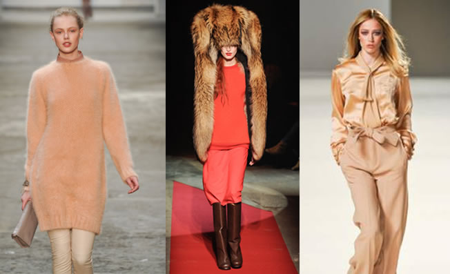 |
| FALL/WINTER 2010: WHAT'S ON THE RUNWAY As noted in the PANTONE Fashion Color Report for Fall 2010, Coral, that softer, more inviting shade of orange, has been all over the runways – from Chloe and Richard Nicoll’s new tonal monochrome statement for Cerruti to Maison Martin Margiela offsetting his take on this warm shade with a gigantic Yeti hat. Check out the hot new runway introductions at RUNWAY/DAILY CHRONICLES on www.stylesight.com |
 |
WILL THE FASHION INDUSTRY MOVE TOWARD SEASONLESS DRESSING? According to David Wolfe, Creative Director at The Doneger Group, the fashion industry's leading source of global trend intelligence, technology is changing today's fashion shows. Wolfe tells us that more and more runway presentations internationally are being livestreamed as they happen. While this does give consumers the instant news they may crave, he questions whether it is smart to show consumers fashion they can't buy for months and months. He believes that the senseless seasonal delivery schedule no longer works and yet the industry clings to the notion that it is smart to deliver in January clothes that are meant to be worn in June. Seasonless dressing is what most consumers want as they truly do buy now and wear now. But, the question is, is the industry really listening? www.doneger.com |
|
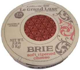
| PACKAGING DESIGN TRENDS: SEARCHING FOR VALUE AND TRADING UP Two key trends have emerged in package design: The search for value and the need to “trade up” in small ways. These trends appear oppositional, but in fact they are not. Value doesn’t always equate to the lowest price. Quality and image are the expectation, perhaps even more than price and efficacy. Those who search for value may find it in a more sustainable, beautiful, functional or innovative package. Trading up is definitely a result of the economic downturn. People who have put aside large purchases and expensive luxuries still want to treat themselves – and package design can be that value-added element. Le Grand Luxe cheese is a good example. The package is innovative and unique: A reusable balsa wood box with two-color hot stamping, wrapped in wax paper like those found at artisanal cheese shops in Paris, give it a premium “rustic and authentic” feel. Yet the line is available in everyday supermarkets for only a slight price difference over other brands. —James Smith, Smith Design smithdesign.com |
 |
|
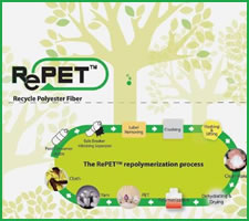 |
SPOTLIGHT ON ASIA: TAIWAN TURNING PET BOTTLES INTO TEXTILES Eco-friendliness can be a perfect match to fashion with major international brands offering green textile products to appeal to consumers. Currently, there are two major categories of eco fibers. The first is made directly from plant fibers such as cotton, linen, bamboo and coconut shell. The second category of eco fibers is produced via recycled materials. The Taiwan textile industry has taken recycling even further and has become well known for their technology that turns recycled PET (Polyethylene Terephthalate) bottles into PET fibers or yarns. Collecting used PET bottles and transforming them into textiles has created a process which is resource-saving, environmentally friendly and socially responsible. www.textiles.org.tw/ |
|
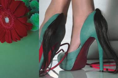 |
HUES FOR SHOES - STEPPING INTO 2011 Shoes are the new “must have” accessory. Wondering which hues will be hot for shoes next spring? In Complementary, a color palette found in Symmetry, the PANTONE/VIEW Colour Planner forecast for Spring/Summer 2011, we find our inspiration in the world of flowers, and see classic styling renewed through color. Complementary plays with the temperature of color in order to achieve a sense of tepidness in the union of two bright and luminous colors. Patchworks shown in different textures, visions and hues are prominent, while glossy or highly polished surfaces take center stage. Find out more at VIEW Colour Planner S/S 2011. |
|
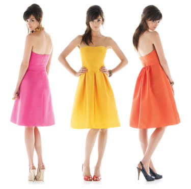 |
BOLDER CHOICES FOR 2010 BRIDESMAIDS Want to see the most popular wedding color combinations? Visit dessy.com/PANTONE and view the hundreds of styleboards already created by brides-to-be, get inspired, and create your own! |
|
 |
| AFRICAN RHYTHMS As Leatrice Eiseman, Executive Director of the Pantone Color Institute tells us, Africa continues to exert a major influence on color for 2010. With South Africa’s selection as host nation for the 2010 FIFA World Cup and Nelson Mandela’s enduring global appeal, African design is ready for the international stage. Filmmakers are increasingly choosing Africa as the location for movies, and holidaymakers are hard pressed to find anything even close to the magnificence of their National parks. And, not only did last fall's New York Fashion Week showcase African designs alongside the likes of Ralph Lauren and Louis Vuitton, but these fashion greats themselves drew on the continent for inspiration for their own collections. www.eisemancolorblog.com |
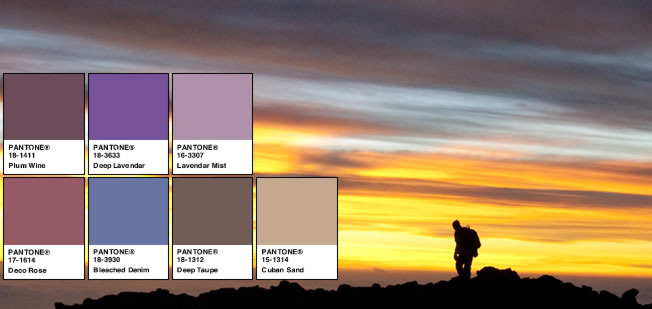
| FASHION COLOR REPORT FALL 2010 Designers continue to exhibit a degree of caution for Fall 2010, yet offer a palette of beauty and excitement with a blending of colors in surprising and intriguing combinations. As Leatrice Eiseman explains, “Building on the color palette from spring, the fall 2010 offerings include innovative takes on fundamental basics as well as transporting, lively colors that conjure images of travel and adventure.” Peek inside our latest fashion color report to find the top colors for fall, the “must haves” for the season, and insights from industry insiders on current fashion trends, as well their new color rules for fall 2010. https://www.pantone.jp/fall2010 |
 |
|
 |
With our trip to Milan extended due to the volcanic ash drifting over Europe, we spent our days hunting for the latest and greatest at the Rho Center and certainly found plenty to see. While some companies are still being cautious in terms of introducing a large number of new products, we were very impressed but not surprised by the continued focus on sustainability and the exciting new technologies being shown in lighting and digital media. Blues were shown in every variation with Turquoise being especially dominant, appearing in a wide variety of materials, from rich soft velvets and bright crystal vases to modern leather seating and wall décor. We saw many shades of red, though looking newest were the deeper pink tones. Orange continues its march to becoming more mainstream with hues leaning toward the softer incantations of melon or clay. Grays, beiges, taupes and off-white took center stage when it came to the larger investment pieces; and khaki, both in tan and greenish undertones, abounded. There were many lighter wood finishes with a mixing of light and dark being the most interesting. Other hot trends were metallic and pearlescent finishes which showed up in a wide array of unexpected places, including molded wood chairs, imprints, grains and patterning within cabinetry, pleating and other distressed-surface materials, including metallics and leather. |
|
お問い合わせ | 資料請求 | 友達に知らせる | メーリングリスト登録削除 | プライバシーポリシー
www.pantone.jpのWEBサイトはパントン社正規代理店 株式会社ユナイテッド・カラー・システムズがパントン社との契約により管理運営しております。
Pantone LLC is a wholly owned subsidiary of X-Rite, Incorporated. Portions © Pantone LLC, . All rights reserved.