Behind the Colors
RELEVANT TREND PALETTES FOR GRAPHIC AND PACKAGING DESIGN
“It’s pretty hard to catch someone’s eye on a shelf in a retail environment without having something out there that shimmers, pops - really just draws them in. That's why we would recommend using a metallic to provide that extra oomph from a visual perspective on-shelf.”
– Ron Furman, Damen Jackson Design Agency Founder/Owner
“In our visual society, where we are option saturated, attention-scarce, and design-obsessed, understanding how to leverage the power of color to tell your story will help you better engage and create strong emotional connections with your target audience, and build greater brand equity in a marketplace where competition for share of mind, heart, and pocketbook is fierce.”
– Laurie Pressman, VP, Pantone Color Institute
Color is a pivotal element of the design process and should be considered at the early stages of a project. Your palette should speak to the message you intend because those first, and maybe the ONLY seconds of impression are in which your product speaks to customers on shelf are crucially valuable.
Presenting a four-part installation of trend-driven color palettes for graphic and packaging design infusing strong core colors with accents of dynamic and engaging metallics. Download and save these colors palettes to consider when creating you next impactful and thoughtful design projects.
ARTFUL SIMPLICITY
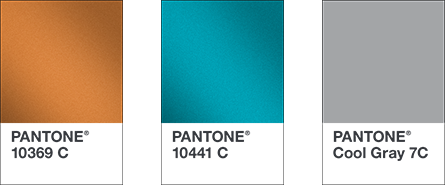
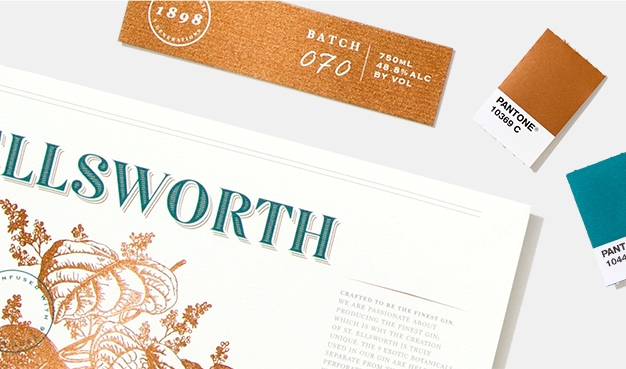
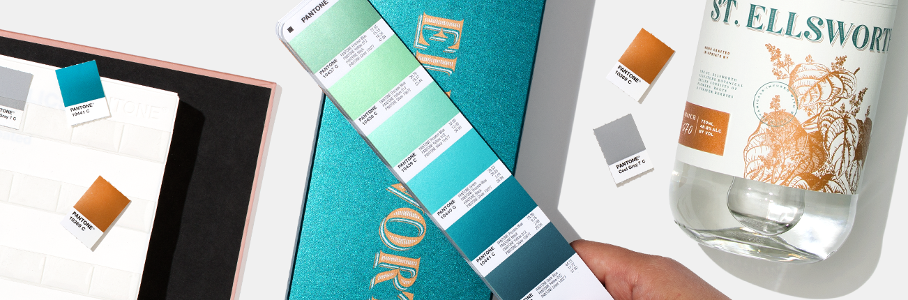
Artful Simplicity is an understated and upscale color range that never goes out of style. Composed and cool, tasteful teal exudes confidence while a timeless mid-tone gray adds an element of chic. Introducing a rich coppery gold to this enduring pair, brings warmth and opulence.